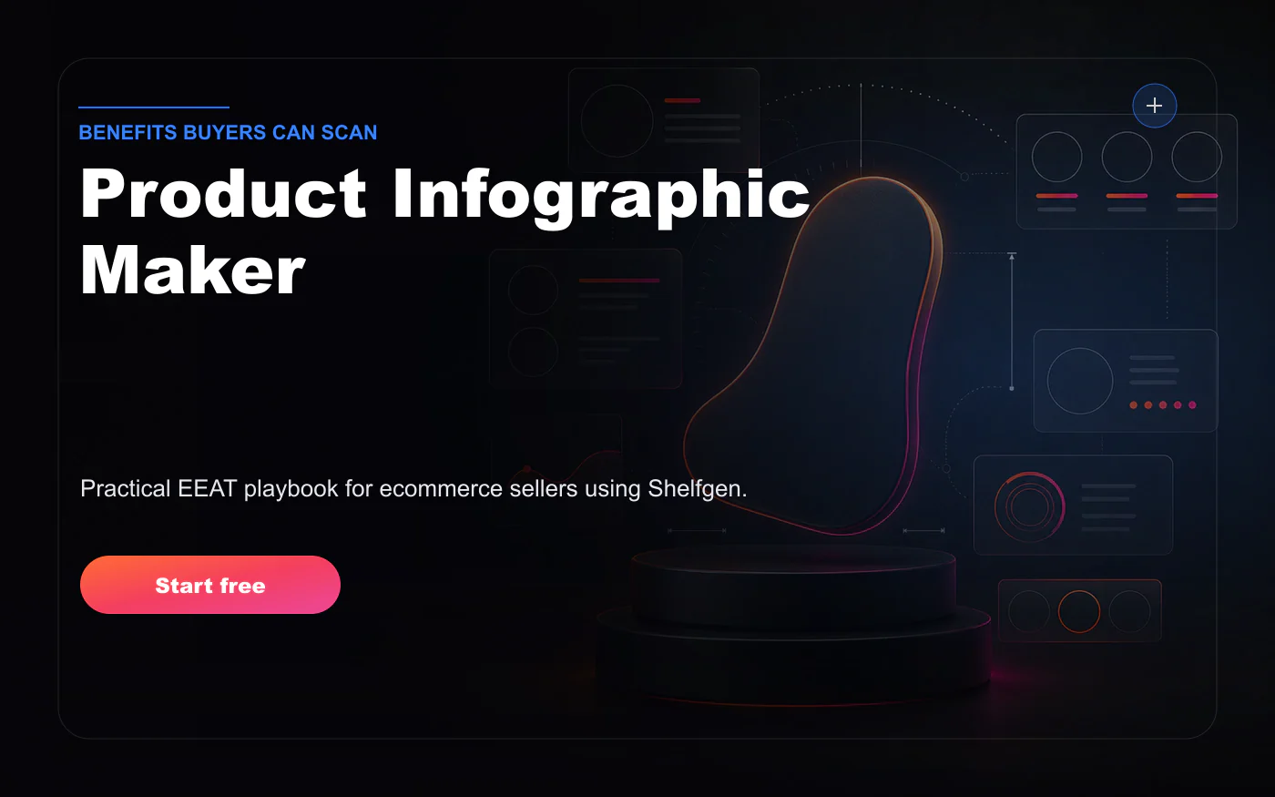
Product infographics sit between product photography and sales copy. They show the product, but they also explain why it matters. A good infographic can make dimensions obvious, clarify included parts, translate technical features into benefits, compare variants, or answer common objections. A bad infographic adds clutter, unsupported claims, tiny text, and icons that make the listing feel cheaper.
We reviewed current top-ranking pages for product infographic makers, Amazon product infographics, ecommerce infographic design, and AI product infographic tools. The strongest pages explain that infographics improve scanning, help buyers understand benefits quickly, and can be used across marketplaces, ads, and product pages. That is true. But the best seller workflow starts before design: decide which claim deserves a visual, which claim needs evidence, and which claim should stay out of the image entirely.
What top pages get right
Top-ranking infographic guides usually recommend clear hierarchy, limited text, strong contrast, and benefit-led callouts. They often show examples with arrows, icons, measurements, comparison grids, and numbered features. These patterns work because buyers scan images faster than they read paragraphs. On marketplaces, especially mobile, a concise infographic can communicate information that would otherwise be buried below the fold.
The danger is that the same patterns can become visual noise. Five badges, eight arrows, three fonts, and a background scene will not make a weak claim stronger. Infographics should reduce cognitive load. If the buyer has to decode the image, it has failed. The best ecommerce infographics feel almost obvious: here is the product, here are the two or three things that matter, here is the evidence or scale needed to believe them.
Choose the claim hierarchy
Before you open a design tool, rank the claims. Start with the buyer's biggest uncertainty. Is the product the right size? Does it fit my device? Is the material durable? What comes in the box? How do I install it? What problem does this feature solve? Then choose one primary claim for the infographic and two or three supporting callouts. Do not try to explain everything in one image.
Separate features from benefits. A feature is what the product has: stainless steel, 30 ml bottle, braided cable, water-resistant shell, adjustable strap. A benefit is why that matters: easier cleaning, travel-friendly size, fewer tangles, better protection, more comfortable fit. Infographics perform best when they connect the two. The feature gives credibility; the benefit gives the buyer a reason to care.
Some claims should not be turned into visual promises unless you have evidence. Avoid medical, safety, performance, eco, compatibility, or certification claims unless the product documentation supports them. A generated badge that says professional grade, non-toxic, waterproof, clinically tested, or compatible with all devices can create real trust and compliance problems if it is not true. EEAT starts with knowing what not to say.
A practical way to choose claims is to sort them into three buckets: visible facts, documented facts, and marketing opinions. Visible facts are things the buyer can see in the image, such as texture, shape, included parts, or connection ports. Documented facts come from specs, test results, certifications, or manuals. Marketing opinions are phrases like premium, best, advanced, or professional. Infographics should lean heavily on the first two buckets and use the third with extreme restraint.
Design for scanning
A product infographic should work at phone size. Use short callouts, clear spacing, and strong contrast. Keep the product as the largest visual element unless the image is a comparison chart. Use arrows only when they point to a real feature. Use icons as support, not decoration. If an icon is not immediately understood, remove it. The buyer should be able to read the image in a few seconds without zooming.
Text density is the most common failure. A good rule: one headline idea, three to five callouts, and no paragraphs. Use plain language instead of internal product jargon. If you sell a technical item, translate specs into buyer outcomes. If the spec must remain, pair it with a short explanation. For example, 18/8 stainless steel is a spec; resists rust and taste transfer is the buyer meaning.
The background should stay quiet. Many sellers place infographics on busy lifestyle scenes, which makes text hard to read. Use a clean cutout, soft gradient, light neutral backdrop, or a simplified scene with enough contrast. If the product is dark, use lighter panels behind callouts. If the product is white, use edge contrast so it does not disappear. Infographics are about comprehension first and style second.
A product infographic should make the buyer smarter in three seconds.
Review for EEAT
Experience shows up when the infographic answers real questions from reviews, support tickets, or category behavior. Expertise shows up when measurements, materials, compatibility, and instructions are accurate. Authority shows up when claims match product documentation and marketplace expectations. Trust shows up when the image is easy to understand and does not exaggerate. This is why the best infographics start from a product brief, not from a template.
Review every infographic like a buyer and like a compliance editor. As a buyer, ask whether the image answers a question that would affect purchase. As a compliance editor, ask whether every claim is true, supported, and within the rules for the channel. Marketplace rules vary, and the main image often has tighter restrictions than secondary images. Keep text-heavy graphics in secondary slots and keep the main image clean.
Shelfgen workflow
In Shelfgen, start with an approved product cutout and a short list of product facts. Choose Product Infographic Maker and select the infographic type: feature callouts, dimension image, what-is-included, comparison, compatibility, or benefits. Add the exact claims you want visualized and mark any claims that should be avoided. Generate a draft, then edit the copy down until the image is scannable.
For Amazon, create infographics as secondary gallery images. For Shopify, use them on product pages, comparison sections, email campaigns, and ads. For wholesale or B2B selling, create a cleaner spec-sheet style version. The same product facts can support several layouts, but each layout should have one job. Do not use a social ad infographic as a marketplace feature image without checking size and text readability.
Once approved, export a high-resolution version and a web-optimized version. Use consistent filenames by SKU and role. Keep the source facts with the image so future updates are easier. If a product changes material, dimensions, included parts, or certification status, update the infographic before the next upload. A stale infographic is worse than no infographic because it creates false confidence.
For teams, the best infographic workflow includes a copy review before design and a visual review after design. The copy review confirms that every claim is allowed. The visual review confirms that the image is readable, the arrows point to the correct places, and the product is still represented accurately. This two-step review is faster than redesigning after a compliance or merchandising issue appears late in the launch process.
Infographics should also be tested beside the rest of the gallery. If the first two images already explain the product clearly, the infographic can focus on one advanced objection. If the gallery is weak, the infographic may have to carry too much information and become crowded. The right design depends on the sequence. A single image can be excellent and still be redundant if the gallery around it already says the same thing.
Infographic checklist
- One primary message and no more than three to five supporting callouts.
- Claims are supported by product data, documentation, or category facts.
- Text is readable on mobile without zooming.
- Arrows, icons, and badges explain rather than decorate.
- The final image belongs in the correct gallery slot for the marketplace or store.
A product infographic maker should help sellers turn facts into visual proof. The goal is not to fill every pixel with persuasion. The goal is to reduce uncertainty. When the product, claim hierarchy, and design system work together, the infographic becomes one of the most efficient conversion assets in the gallery. It shows buyers what matters, why it matters, and why they can believe it.
Variant products need extra care. If one infographic compares sizes, colors, bundles, scents, or compatibility options, make sure the highlighted variant is the one the buyer is viewing or that the comparison is clearly labeled in the surrounding page. A comparison graphic can increase confidence, but it can also create confusion if the buyer thinks an accessory, larger size, or alternate color is included. For multi-variant catalogs, build comparison templates deliberately and keep SKU-specific exports separate.
Sign in, upload one product photo, add your real product facts, and create a scannable buyer-ready infographic.
Compare image roles across Etsy, eBay, Google Shopping, TikTok Shop, Amazon, and Shopify.
Plan listing thumbnails, gallery crops, and detail shots that help buyers inspect handmade products.
Use the help guide for practical export notes before publishing marketplace assets.